2015 / Academic work (in: corporate identity)
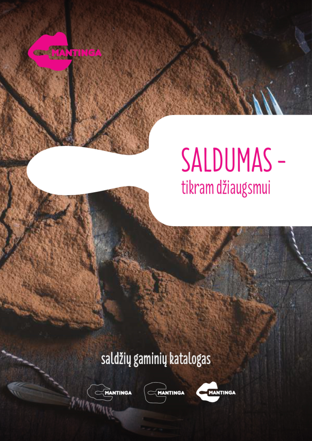
The task was to analyse and renew the logo of a well-known lithuanian bakery and snacks brand “Mantinga”. As the process of kneading dough is one of the primary stages of bakery’s products, dough piece and a rolling pin were used as main elements of the new dynamic logo. In order to not weaken brand’s recognition, same red colour and typo (with minor fixes) in the main version of the logo were used, and their slogan “Heat. Cold. Love” was incorporated.
As the research showed and the slogan “Heat. Cold. Love” confirmed, company’s products can be divided in three main categories: fresh bread&pastries, frozen dough&chilled products and sweet pastries. Different shapes and colours of dough were used in order to distinguish these categories.