
2019 / Client: Fritz&Sehr Mittelstandsnachfolge GmbH
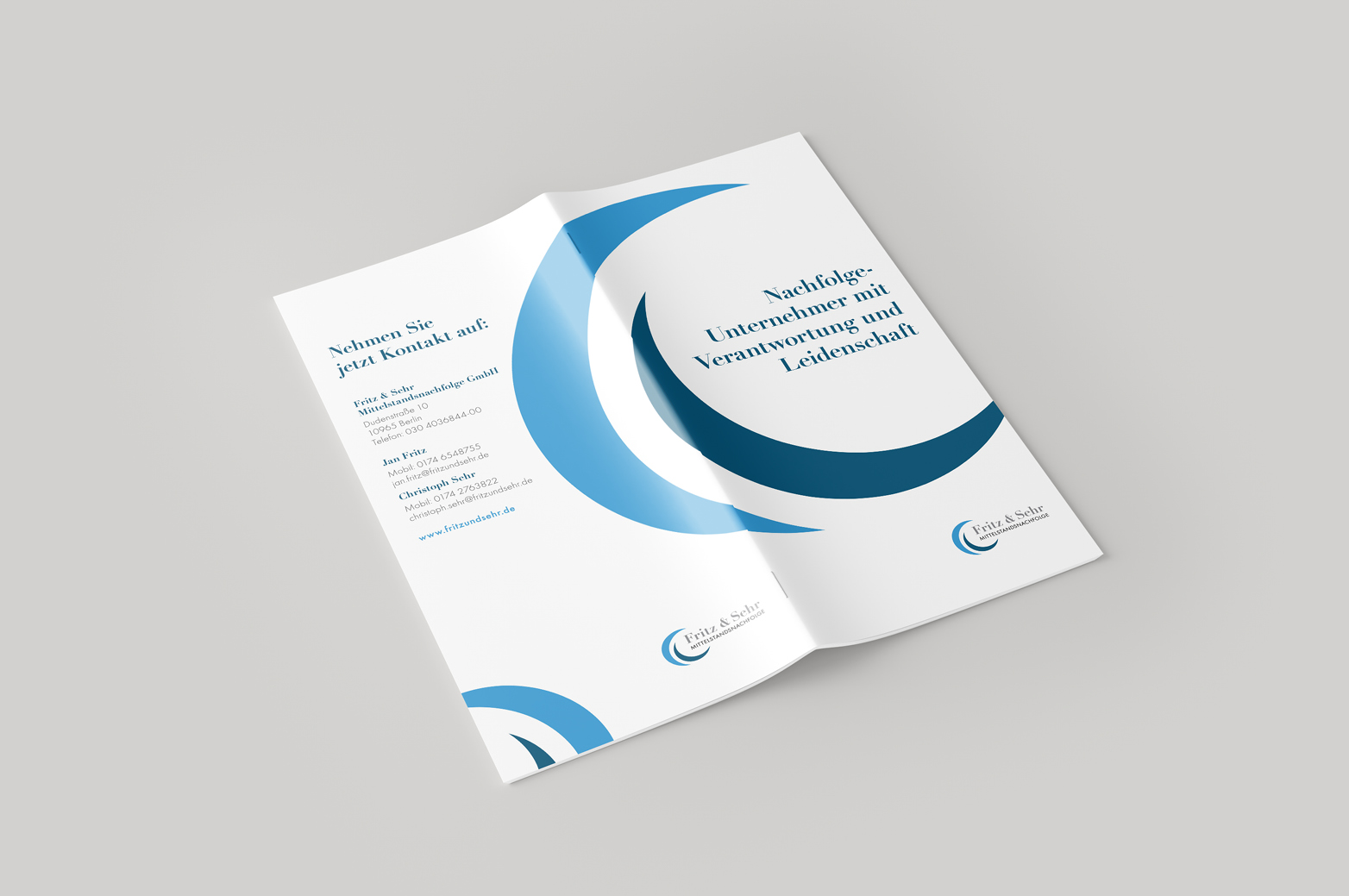
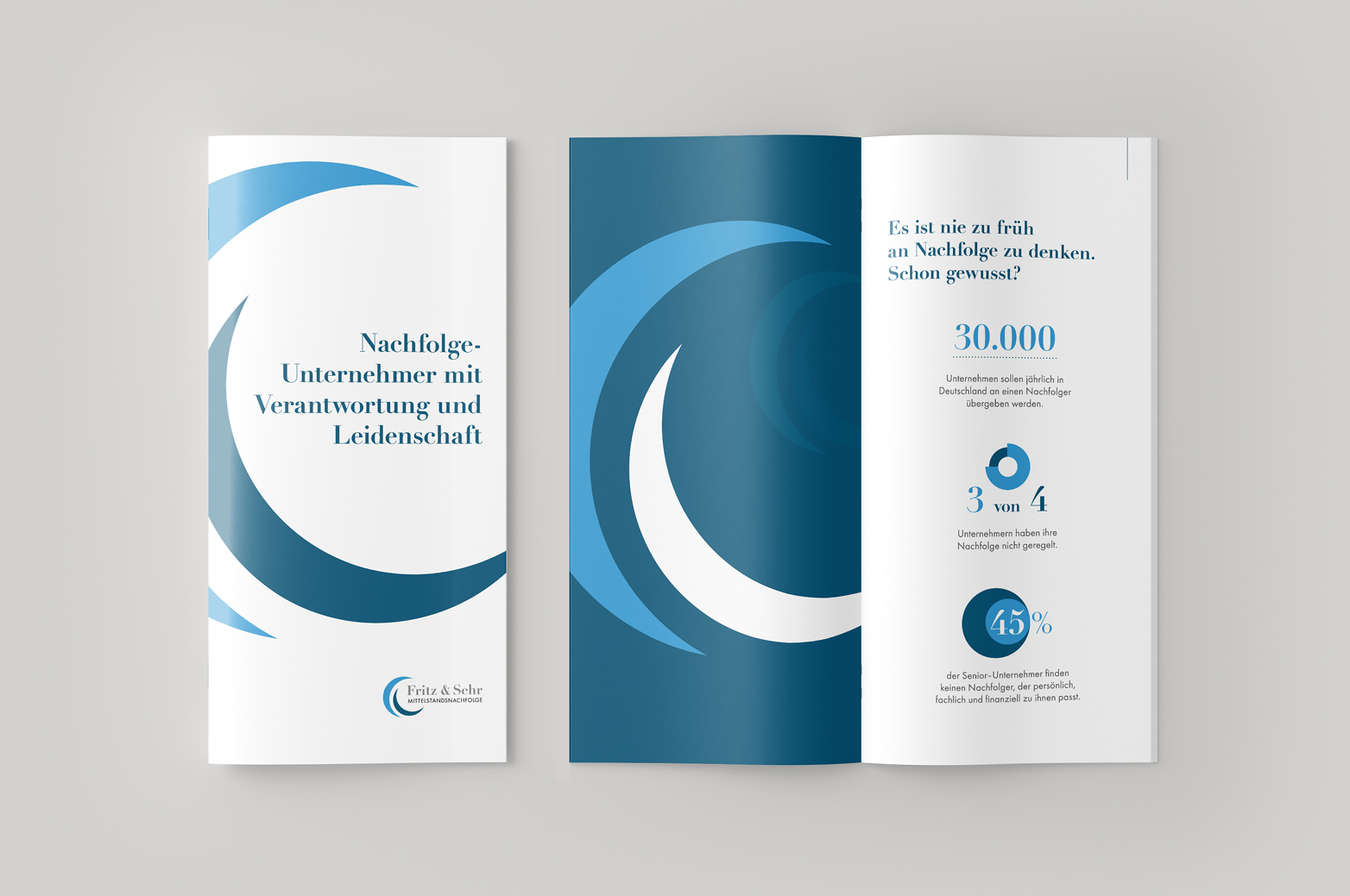
The successful management of corporate succession is becoming a key challenge for the enterprises in Germany. Fritz & Sehr stand as a reliable partner and successor for medium-sized companies.
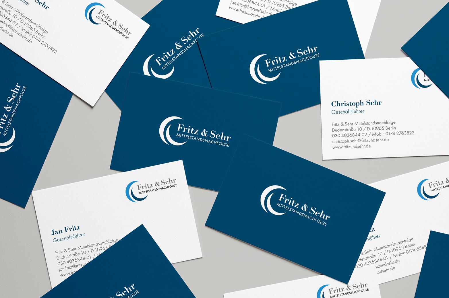
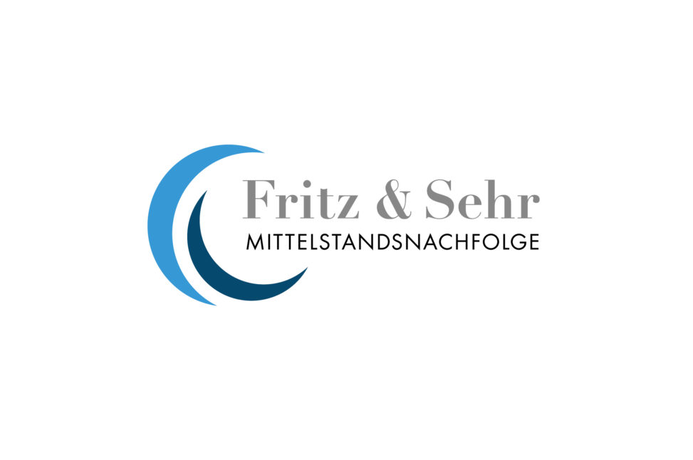
Logo brief: simple, trustworthy, traditional german style, blue colours.
Logo result: The two shapes of the logo represent the same level of professionalism, and different shades of blue – two different generations. The light blue stands for a successor, who gives a promise to lead the company in the same professional way as its previous owner (dark blue shape) did, and will make it successful by adding his fresh enthusiasm, modern mindset and skills. Futura type, as it has been widely used in german design over decades since its creation by P. Renne, makes the promise of the successor sound solid and trustworthy.